 |
This piece was done using the technique known as "backlit" airbrush on cels (gone the way of the Dodo, thanks to computers) where high-contrast negatives (hi-cons) which are either clear or solid black--no greys--are made for each surface element in the art, and all pin registered to each other with precision holes that are punched into the film and then placed over like registration pins on a lightbox to line each element up, so it always falls in exactly the same place when placed on the pins. Each surface element has its own negative which is then placed on the lightbox and photographed with a down-shooting 35mm motion picture animation camera loaded with color film that can take one frame at a time.
As I had done "The Abyss" title for Jim, I had an inside rail to pitch for the T-2 title because Ernie Farino, who had designed and directed the orginal, wonderful Terminator title was too busy. I told Jim I wanted to do it and he gave a me a script to read overnight. I loved the script and could see the whole movie right away and came up with a cracking opening sequence which took me a week to storyboard. I met with Jim in his spacious office as he leaned back to hear my pitch. When I finished, he said, "It's perfect. Give me a schedule and a price."
I went home to figure it all out and the following day got a call from Jim's assistant...could I come over to discuss the title? I showed up, Jim cleared everyone out of his office and said, "Paul, I love your title sequence, but it gets in the way of my movie. If I had my way, there would be NO titles to films because they interrupt the flow of the opening sequence."
Well, I have tremendous respect for Jim, and NO ONE who works with him stands toe-to-toe with him unless they are willing to have a swordfight....but I wasn't going to let him get away with this because my sequence complemented his opening scene and segued perfectly into the body of the film, while getting done all the necessary things that need getting done with opening credits and main title. I told him why it was the right approach and buttoned my argument up so he had no room to move. Jim smiled and said, "Paul, you're a title designer, and I respect that and the fact you are fighting your corner...and your sequence is terrific, but...it gets in the way of MY movie...we gotta cut it down."
I argued my corner some more, but Jim was adamant. After all, it was his film, what could I do, really? Still, we kept a couple of bits, but I was unhappy about the transition into the film...something was missing (my whole segue!). I mentioned this to Jim and he agreed and we discussed it, but could come up with nothing that was quick and powerful. All we had were flames to push through into the movie...not good enough. Then it hit me: Jim banged his hands on the desk in frustration and said, "What!!??" I smiled. "Jim, what's the most powerful visual in the whole film?" He looked blankly at me. I pressed on, "What's one of the great images in the history of film-making?" He still was blank. I smiled and said, "The SKULL!"
Jim's face lit up and he said, "Of COURSE!" So, we had the skull push through the flames and Jim had his abbreviated, but effective sequence! And I wish I still had those storyboards which I lost track of because I left for England shortly thereafter. Damn. 'Best storyboards I've ever done.
Right...back to the art:
The artwork is all generated in black-and-white. A color filter (in this case, blue) is placed over the lens of the camera, and an exposure made of the backlit element on the lightbox; then the film is advanced one frame, the piece is moved slightly (if it is animated) and another exposure made, and so on. Then the film is backed up to the beginning frame, a new element is placed on the lightbox, and the whole process begins again until all the elements have been exposed onto the film like jigsaw puzzle pieces, making the whole picture finally appear on it. As you can imagine, this process can take days, and usually took weeks because of all the testing of each color and each exposure that had to be made to make the final piece look integrated.
In order to get tones and modelling into the clear "windows" the negatives make of each element, I would place a punched, frosted, acetate cel (which is simply a 12" X 16" sheet of acetate plastic) over the negative on my lightbox, then airbrush in black ink the tones I wanted for each element. At this point, it's all experience and guesswork, so I would usually make several densities of airbrush renderings for each element...a lot of work, but quick to do, once you know what you are doing. There is no need of friskets (stencils) because the black overspray from the airbrush goes over black areas of the film and is not seen.
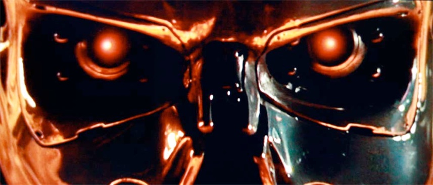
Jim Cameron wanted a brushed metal look. Could I do it? Yeah-h-h-h, Jim....of course I could! The fact that I didn't have a clue as to how I was going to do it was irrelevant....I just knew I would come up with something...OK, I just knew I HAD to come up with something! You don't say "can't" to Jim...he can do everything, so why the hell can't you?
I achieved the metal look by simply pulling various grades of sandpaper across a clear, soft acetate cel, etching the grit into the plastic. I then airbrushed some dark tones at a low angle onto the cel, and the grooves picked up the ink and accented the refraction of light from the box and....PHEW! METAL!!
But it's not an easy trick to hand-pull sandpaper in a straight line across 16 inches....that took me a whole afternoon and a packet of 50 cels to achieve, even using a jig. I had acetate shavings everywhere for months.
The sparkles and highlights are made with pin holes in a solid black piece of film, placing a star filter over the camera lens and making a long exposure, which burns out anything previously laid in. Little windows are made for larger areas. Each exposure has to be tested, so it is a long process to come up with the goods, having to process the film overnight in the meantime, testing, and re-testing until each element is just where you want it. This animated title took three weeks of solid work (16 hours a day) to prepare, then five more of shooting and testing, and re-doing airbrush elements to get right.
But....we got it right!